Table of Contents
Title Page
Copyright Page
Dedication
Acknowledgments
Introduction
Chapter 1 - ORTHOGRAPHIC DRAWINGS
MATERIALS, TOOLS, AND EQUIPMENT FOR MANUAL DRAFTING
UNDERSTANDING ORTHOGRAPHIC PROJECTION DRAWINGS
ORTHOGRAPHIC PROJECTION DRAWINGS FOR INTERIOR ENVIRONMENTS
REFERENCES
Chapter 2 - THE DESIGN PROCESS AND RELATED GRAPHICS
PROGRAMMING
DIAGRAMS AND PROGRAMMING ANALYSIS GRAPHICS
PROGRAMMING MATRICES
SCHEMATIC DESIGN
DESIGN DEVELOPMENT
REFERENCES
Chapter 3 - PARALINE AND PERSPECTIVE DRAWINGS
PARALINE DRAWINGS
PERSPECTIVE DRAWINGS
DEVELOPING VISUAL SKILLS
REFERENCES
Chapter 4 - DRAWING AND SKETCHING INTERIOR ENVIRONMENTS
ESTIMATED ONE-POINT INTERIOR PERSPECTIVE DRAWINGS
ESTIMATED TWO-POINT INTERIOR PERSPECTIVE DRAWINGS
REFINED LINEAR PERSPECTIVE METHODS
TWO-POINT PLAN PROJECTION METHOD
PREPARED PERSPECTIVE GRID CHARTS
USING PHOTOGRAPHS
DIGITAL MODELS AND DRAWINGS
DRAWING COMPOSITION AND CROPPING
REFERENCES
Chapter 5 - RENDERING
RENDERING AS ILLUMINATION
MATERIALS, MEDIA, AND TOOLS
RENDERING ORTHOGRAPHIC PROJECTION DRAWINGS
RENDERING PERSPECTIVE DRAWINGS
REFERENCES
Chapter 6 - SCALE MODELS
MATERIALS AND TOOLS
CONSTRUCTION AND USE OF MODELS
REFERENCES
Chapter 7 - PRESENTING MATERIALS AND FINISHES
MATERIALS AND MEDIA
ORGANIZATION AND COMPOSITION
TECHNIQUES AND METHODS OF PRESENTATION
REFERENCES
Chapter 8 - MAKING THE COMPLETE PRESENTATION
ORGANIZATION AND COMPOSITION
TECHNIQUES AND METHODS OF PRESENTATION
PUBLIC SPEAKING AND DESIGN COMMUNICATION
REFERENCES
Chapter 9 - PORTFOLIOS AND RESUMES
GRAPHIC DESIGN COMPONENTS
THE RESUME
THE PORTFOLIO
THE DIGITAL PORTFOLIO
REFERENCES
APPENDIX 1 - DIRECTORY OF FEATURED PROFESSIONALS
APPENDIX 2 - BLANK CRITERIA MATRIX
APPENDIX 3 - DRAWING ELEVATIONS: A RESIDENTIAL CASE STUDY
APPENDIX 4 - COLOR THEORY FOR RENDERING
APPENDIX 5 - SCALE FIGURES AND ENTOURAGE
APPENDIX 6 - TWO-POINT PERSPECTIVE GRID
INDEX
For
Roger, Anna, and Luc
ACKNOWLEDGMENTS
This book, like the other editions, compiles the work of many hands (and keyboards) and conversations. It has been made possible by the generous contributions of numerous people, to whom I would like to express my gratitude.
First, I must acknowledge my current and former students, who have taught me volumes and who continue to give me the energy to keep going. This edition includes work by the following talented and hardworking, current and former students:
Tiffany Baca, Nicole Banaszewski, Laura Blanchard, Nina Bruss (Bouten), Tina Bucher, Ciarah Coenen, Laura Eysnogle, Ellie Feenstra, Stephanie Holmblad, Megan Gruner, Amber Liestman, Jenna Michels, Laura Purcell, Sunny Reed, Vicky Salzsieder, and Mary Wawra.
I must thank all of the former students who contributed work to earlier editions: Kristy Bokelman, Dan Effenheim, Denise Haertl, Anne Harmer, Theresa Isaacson, Leanne Larson, Anne (Cleary) Olsen, Ardella Pieper, Cory Sherman, Angela Skaare, Justin Thomson, and Randi Steinbrecher. And I thank former exchange students, Laura Sudbrock and Ilka Schnelle, whose works are included in this edition, as well as Jessica Tebbe and Dirk Olbrich, whose works were featured in previous editions.
I have been amazed and touched by the generosity of members of the design community who shared time and contributed projects. Traci Lesneski and the staff at Meyer, Scherer & Rockcastle, Ltd. (MS&R) generously allowed me to review projects and contributed excellent project work. The staff at Cuningham Group Architecture contributed time and a range of projects and process work. Jim Smart of Smart Associates graciously contributed work for this and previous editions.
Conversations with my friend Lynn Barnhouse were instrumental in helping to develop the first and second editions. This and previous editions include generous contributions of time and work by Jane Rademacher; Thom Lasley; Thomas Oliphant; Jim Moeller, at Arthur Shuster Inc.; Craig Beddow, of Beddow Design; Janet Lawson, of Janet Lawson Architectural Illustration; Robert Lownes, of Design Visualizations; and Harris Birkeland.
A special thanks to Matthew Saunders, a gifted illustrator and designer for his significant contributions: His skills in digital and manual rendering and drawing enrich this edition immensely.
Melissa Brewer contributed new CAD drawings as well as Photoshop contributions; this book would not have been possible without her. Her talents, insights, and great attitude made many good things possible—as usual. I am especially grateful for her prompt help with many last minute requests.
I must acknowledge and thank my current and former University of Wisconsin- Stout colleagues. Courtney Nystuen, a wonderful teacher and architect, contributed in many ways to all editions. Kristine Recker Simpson and Jack Zellner contributed work to this and the previous edition. Additionally some typically excellent student work from Ms. Recker Simpson’s courses has been included in this edition. Shelley Pecha kindly (and quickly) contributed to this edition. Bill Wikrent and the staff (including Andrew Bottolfson and Katie Hladilek) at Learning Technology Services contributed all of the photography included, unless otherwise noted.
Thank you to Margaret Cummins and Lauren Poplawski at John Wiley & Sons. Also special thanks to Ava Wilder and Brent Savage at Wiley, and Jeff Baker, all of whom are responsible for the beautiful appearance of this edition.
My parents Robert and Margaret Mitton and my siblings, Michele, Marilyn, and Mark, provided emotional support at a very difficult time and I appreciate this greatly. All of their contributions made this edition possible and I am very thankful for the help and kindness of so many.
INTRODUCTION
The first edition of this book was intended as a primer on interior design visual communication, one that presented a range of styles and techniques. The goal with that and each later edition has been to provide students and practitioners with up-to-date information on visual presentation techniques. Like earlier editions, this book identifies methods used in the visual presentation of interior spaces and articulates them in written and visual language. Various phases of the design process are discussed in order to reveal the connection between process and presentation. Some often overlooked basic principles of graphic design and portfolio design are also discussed.
Research for this edition made clear the significant role computer-generated imagery plays in current practice and in the academic world. Despite this, hand drawing continues to be a useful tool, particularly in producing perspective drawings and in visual note-taking. Quickly created perspective drawings offer the benefit of providing designers with a visualization tool early in the design process, prior to the time finalized design drawings are complete. In addition, skills learned in drawing by hand transfer directly to computer modeling. The ability to create quick perspective sketches in client conferences and in team meetings is a highly useful tool; this is something that I have heard many times from those hiring designers. For these reasons, numerous examples of quick sketching techniques are included.
This book covers methods of manual drawing and presentation that can be found, at least in part, elsewhere—with the exception of estimated perspective sketching. Estimated sketching requires “eyeballing” perspectives, a method that I have found works well for students, although many educators find it horrifying. In addition to estimated sketching, information on more traditional methods of perspective drawing is included.
As this edition goes into production, designers are using computers for most drafting, three-dimensional modeling, rendering, image manipulation, and composition of presentations. Hardware and software may vary, but presentation has gone digital to a large degree. While this book does not go into a great detail about any particular software, it is meant to provide a brief discussion of the most widely used programs and to provide specific details about some software as it relates to presentation. For example, while this book provides very little in-depth coverage of Adobe Photoshop®, it does provide some instruction related specifically to rendering using Photoshop—which is common in current practice. Therefore, a working knowledge of some basic software programs is required in addition to the instruction provided in this book.
This book offers a only a cursory description of most three-dimensional modeling software with the exception of a basic introduction to SketchUp software. My reasoning here is that I have found SketchUp to be the most intuitive of modeling software (although it certainly has limitations) and it allows for easy and quick success. This ease allows for use of SketchUp early in the design process, as well as at many points along the way, making it much like handsketching.
At this time, many designers continue to present projects using traditional presentation boards and those are covered in detail in this edition. Information is also provided about digital presentations methods, as many designers are creating completely digital and virtual presentations. Clearly we are at a time of transition, where new methods are employed by some and “traditional” methods are favored by others—both are covered in detail in this edition.
As with earlier editions, many of the examples included here were executed by undergraduate design students. I’ve included these because I want students to see real examples of developing skills. It is important for all designers to develop drawing and sketching skills. Drawing and modeling building should not be reserved for the final presentation of fully developed designs. Instead, sketching, drawing, and model building must be acknowledged as ways of seeing and exploring throughout the design process—from beginning to final presentation. I admit my desire to get interior designers to draw (and draw and draw). It is the best way to learn to visualize and develop good work.
Examples of work done by professional illustrators, digital illustrators, and model makers are also included in order to demonstrate what is being done in current practice by specialists. The work is beautiful and highly professional, and it depicts what top professionals can produce. We can learn from this work and allow it to influence our design drawings and in-process presentations.
Many chapters begin with information about specific materials and tools. Each provides written instructions in the text as well as step-by-step illustrated instructions. In teaching, I’ve found that some students learn best by reading, while others learn by following brief graphic guides. My goal is to provide instruction for a variety of learning styles. The examples and projects presented here vary in scope from small residential student projects to huge public interior spaces designed by professionals; this is a means of acquainting readers with the range of projects professional designers are involved in.
In completing this edition I came to some conclusions. One is that while much has changed since the first edition—particularly related to digital technology—so many things have stayed consistent, particularly regarding the process of design and the complex yet flexible type of thinking required of a professional designer. This continues to be a profession populated by bright, creative individuals who are required to call upon a broad range of talents and skills in everyday practice. While technology has made many things easier and faster, today’s designers are required to know more and to possess more skills than at any time previously. I hope this book will help today’s designers in their acquisition of some of the many skills required in current practice.
1
ORTHOGRAPHIC DRAWINGS
Interior design is a multifaceted and ever-changing discipline. The practice of interior design continues to evolve due to technological as well as societal changes.
The sentences above were written roughly ten years ago, in the introduction to the first edition of this book, and continue to hold true today. Digital technology continues to influence and to work as a change agent in the ongoing evolution of design practice. Today’s practicing interior designers use software for drafting, three-dimensional modeling programs, digital rendering programs, digital imaging software, as well as a range of word processing, spreadsheet, and presentation programs.
In addition to undergoing constant, rapid technological advancement, the profession of interior design has grown in terms of scope of work, specialization, and the range of design practiced. The growth of the profession, combined with efforts toward development of educational standards, registration, and licensing, have increased its legitimacy as a serious professional discipline.
Constant change in society and in one’s profession can be overwhelming and a bit frightening, and for that reason it is useful to consider the elements that remain constant in an evolving profession. In many ways, the design process itself remains constant—whether practiced with a stick in the sand, a technical pen, or a powerful computer and software. There are many stories about designers drawing preliminary sketches on cocktail napkins or the backs of paper bags, and these stories lead us to a simple truth.
Professional designers conduct research, take piles of information, inspiration, and hard work, and wrap them all together in what is referred to as the DESIGN PROCESS, to create meaningful and useful environments. A constant and key factor in interior design is the fact that human beings—and other living creatures—occupy and move within interior spaces. To create interior environments, professional designers must engage in a process that involves research, understanding, idea generation, evaluation, and documentation. These are significant constants that exist in a changing world.
For the most part this book covers the process designers engage in and the related presentation techniques used in DESIGN COMMUNICATION. These processes and basic concepts are consistent, whether generated manually or by computer. Some examples included here were created manually, whereas others were computer generated. Regardless of how drawings and graphics are generated, they are part of a process of discovery, exploration, and creation.
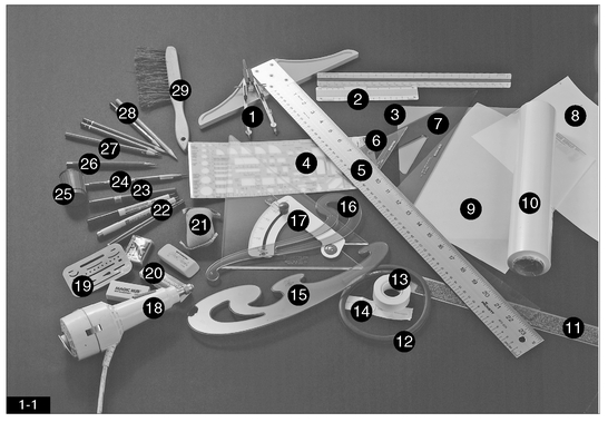
FIGURE 1-11 1. Compass
2. Architectural scales
3. Drafting film
4. Template
5. T square
6. Lettering triangle
7. Triangle
8. Appliqué film
9. Vellum
10. Tracing paper (roll)
11. Cork-backed ruler
12. Flexible curve
13. Drafting tape
14. Drafting dots
15. French curve
16. French curve
17. Adjustable triangle
18. Electric eraser
19. Eraser shield
20. Erasers
21. Dry-cleaning pad
22. Disposable ink pens
23. Technical pen
24. Lead holder
25. Lead pointer
26. Mechanical pencil
27. Wooden graphite pencils
28. Layout pencils
29. Drafting brush

This chapter covers what is often referred to as drafting, as well as other forms of two-dimensional graphics; this specific type of drawing is required for all projects that will be constructed. The term DRAFTING refers to measured drawings done with specialized tools and equipment. The truth is that not all drawings used in the process of interior design are drawn with the aid of drafting tools or computers. Often those drawings created in the preliminary stages of the design process are rough sketches and involve little use of drafting tools or equipment. As designs are refined, there is clearly a need for highly accurate, measured, and detailed drawings, and these are drafted with tools.
This chapter presents the materials, equipment, and tools used for manually drafted and freehand design drawings, as well as an overview of the most common drawings used in interior design practice. The information presented in this chapter is meant as an overview, not a definitive drawing or drafting reference. Subsequent chapters cover the other forms of drawings and design graphics used in sketching, and other forms of idea generation.
MATERIALS, TOOLS, AND EQUIPMENT FOR MANUAL DRAFTING
The graphics and drawings used in interior design practice vary, ranging from conceptual sketches and rough layouts to measured technical drawings. The materials, tools, and equipment used to create the variety of drawings and graphics are numerous and ever proliferating. The media and tools selected must be appropriate to the task at hand. This means that their proper selection requires careful consideration of the drawing type and use, as well as an understanding of the available products. Currently most schools and design firms create the majority of design drawings digitally, using COMPUTER-AIDED DESIGN (CAD) programs. However, some students begin the study of drafting by creating drawings manually; for that reason a description of manual drawing tools and equipment follows. Figure 1-1 illustrates commonly used manual drafting and drawing materials and equipment, which are discussed as follows.
Drawing Surfaces
The type of drawing surface selected directly affects the quality of the drawn image. Some surfaces accept pencil and ink readily and allow for clear, consistent imagery. Transparent papers allow for diazo reproduction (blueprinting) and can be used as an overlay to continue a drawing by transferring details from one sheet to another. Drawings produced on nontransparent surfaces are reproduced by photocopying, digital reproduction (scanning), or photographic processes.
TRACING PAPER is the most common paper surface for sketching in-process design drawings and graphics. Known in various parts of the country as trace, flimsy, and bumwad, this paper is highly transparent and relatively inexpensive. Tracing paper is available in cut sheets and in rolls in a variety of sizes. Rolls of tracing paper work well for interior design drawing because of the varying sizes of drawings required. Tracing paper is available in white, buff, and canary (yellow). Most designers have a personal color preference based on previous experience. Some designers use tracing paper to create actual presentation sketches (used to communicate with a client or end-user) while others use them only for personal exploration.
Because tracing paper is relatively inexpensive, it can be used to develop preliminary sketches and for in-process drawings. This allows for exploration through the creation of many sketches and the generation of many ideas. Tracing paper also works very well overlaid on drawings for transfer and refinement of images. Often many layers of tracing paper are overlaid as a design is refined or as a complicated perspective drawing is constructed. Images on tracing paper can be reproduced easily by being photocopied or being scanned for inclusion in design presentations.
While this is done less commonly in current practice, final design drawings created manually and intended for diazo reproduction are drawn on DRAFTING VELLUM, a transparent paper available in a variety of finishes and weights (thicknesses) and most often white. Drafting vellum should have a high rag or cotton content, giving it a rich finish, strength, and good stability. It is excellent for line work generated with graphite pencils. Good-quality diazo prints can be run from drafting vellum originals. Vellum is also photocopied, scanned, and photographed with excellent results.
In addition to vellum, PLASTIC DRAFTING FILMS are used for final drawings and for some design presentations. Plastic (and polyester) drafting films are expensive, tear resistant, and generally do not react to fluctuations in temperature or humidity (as do many paper surfaces). They accept ink beautifully and allow for easy ink erasure. These films require the use of special pencils. Drafting film originals produce excellent diazo prints and photocopies. For years prior to the use of CAD, plastic film and ink drawings were considered the finest for reproduction.
A range of ART PAPERS is available; the papers are made with a variety of materials and come in many colors, sizes, and finishes. Some of these papers can be used as a drawing surface or as a background or visual element included within a presentation; a range of paper types is discussed in Chapter 5, beginning on page 145.
ADHESIVE REPRODUCTION FILM, also called appliqué film and often referred to generically as sticky back, is used on vellum or bond drawings. Typed or printed images can be drawn or photocopied onto adhesive reproduction film. The film is then carefully measured and cut and applied to the vellum or bond paper.
Manually generated design drawings can be reproduced on large-format photocopying machines. However, CAD-generated drawings—printed or plotted on bond paper—are the most commonly used in current practice. It is also worth noting that many designers and design firms scan hand drawings and combine them with additional graphics using imaging software such as Photoshop or page layout software such as InDesign® to create digital presentations such as those in discussed in Chapter 5, page 157 (Digital Rendering).
Line- and Mark-Making Implements
Lines and marks record spatial information in interior design drawings and graphics. Control of line thickness and the type of stroke used are important and convey specific information. Thus, the implement used to create lines and marks is a key factor in manually created design drawings.
GRAPHITE is mixed with clay and other elements to produce what are commonly called lead pencils. Graphite pencils, used in design drawing, are available in a range of hardnesses based on the mixture of clay to graphite. Graphite pencils and replaceable “leads” are coded with a standard rating system: H stands for hard, B stands for black (the softer leads). The number found next to the H or B refers to the level of hardness. For example, a 6B is softer than a 2B; an 8H is very hard. F-rated leads are at the center of the range, and HB leads are slightly harder than Bs. The softer leads are used in sketching and rendering, whereas H, 2H, and sometimes F leads are most commonly used in drafting.
The graphite described above is used in a variety of mark-making implements. WOODEN DRAWING PENCILS involve a graphite mixture encased in wood and are sharpened like standard wooden writing pencils. MECHANICAL PENCILS are hollow instruments that hold very fine graphite leads. These are sold in a variety of lead widths to create a range of line weights. LEAD HOLDERS are hollow implements that accept thicker leads than mechanical pencils. Although lead holders do not allow for any variety in lead widths, they do accept a range of lead types in terms of softness. Lead holders require the use of a specialized sharpener, known as a LEAD POINTER.
Specialized colored drafting pencils and leads can be used to develop drawings prior to hard-lining them. NONPHOTO-BLUE colored pencils do not reproduce when photographed; however, they sometimes reproduce when photocopied. NONPRINT colored pencils do not reproduce in diazo prints. When appropriate, both types of pencil can be used to lay out drawings prior to completion.
One of the significant advantages of using graphite pencils is the ease of erasing. Harder leads are often the most difficult to erase, whereas soft pencil marks are easily lifted with gray kneaded erasers or pink erasers. Plastic and film erasers can be used to remove marks made with harder leads. A metal ERASER SHIELD is used to protect the drawing surface from unwanted erasing. DRY CLEANING PADS, containing art gum powder that sifts onto drawing surfaces, are available to keep drawings clean.
TECHNICAL PENS have tubular points and refillable ink reservoirs. They are available in a range of point sizes that allow for absolute control of line weight. Because they employ black ink and metal points, technical pens create the finest line work of any drawing implement. They must be used with the appropriate ink, as specified by the manufacturer.
DISPOSABLE TECHNICAL PENS combine a tubular support with a felt tip and are available in a range of point sizes. These pens require no maintenance or cleaning, making them easy to use. Although disposable pens have been known to skip, causing inconsistent line work, they have improved a great deal recently and are becoming very popular.
FELT-TIP PENS are available in a range of styles and point sizes; they are often used in sketching, exploration, and rendering. Felt-tip pens are not generally used for refined drafted drawings or working drawings.
Erasing ink marks is rather difficult and requires special erasers. Hard plastic erasers can remove ink. However, an ELECTRIC ERASER with the appropriate eraser insert is most useful in removing ink. Electric erasers are very effective but must always be used with an eraser shield. Ink marks on film are erased more easily than those on vellum. Sharp razor blades are sometimes used to scrape ink away from drawing surfaces.
A quality DRAWING BOARD is required for the creation of successful drawings. Serious students must purchase a topquality drawing board if possible. The board should accommodate a minimum paper size of 24 inches by 36 inches. Drawing boards should be covered with a specialized vinyl drawing surface, sold at drafting and art supply stores. The vinyl surface helps to improve line consistency.
T SQUARES are used in conjunction with the edge of the drawing board to provide an accurate horizontal line or right angle for drawings. PARALLEL RULERS can be attached to drawing boards using a system of screws, cables, and pulleys. This creates the sliding straightedge that is the standard in professional practice. Triangles are used with a T square to create vertical and angled lines. Adjustable and 45/45-degree and 30/60-degree triangles are readily available. Triangles should be fairly clear, easy to see through, and as substantial as possible. An inking triangle with raised edges is required when using ink. It is also useful to have a tiny triangle on hand as an aid in lettering. Triangles should never be used as a cutting edge; this will ruin them. A cork-backed metal ruler is the best edge for cutting.
DRAFTING TAPE or PRECUT DRAFTING DOTS are used to attach drawings to drawing boards. Unlike standard masking and household tape, drafting tape and dots are easy to remove from both the paper and the drawing board. A DRAFTING BRUSH is used to remove eraser debris from the drawing surface.
Measured interior design drawings require the use of a proportional scale. This allows for large areas to be reduced in size to fit on relatively small drawings. An ARCHITECTURAL SCALE is the standard scale ruler used in interior design drawing. In the United States, standard architectural scales employ imperial units, that is feet and inches. Standard architectural scales are marked incrementally with numbers running from left to right, with a number or fraction to the right or left of the incremental lines that indicate scale. For example, in ¼-inch scale the ruler is marked so that each ¼-inch measures 1 foot in scale. Architectural scales have inches marked below the zero marking; these are used to measure elements that are not exact to the foot. In transferring measurements, great care should be taken to record accurate dimensions. Scale rulers should never be used to draw against, as this would result in poorly drawn lines and damaged rulers. More information on the actual scales used for specific types of drawings can be found later in this chapter.
An ENGINEER’S or ENGINEERING SCALE is used for measuring larger scale items, typically related to building sites, roads, topographical features and other items such as water and sewer lines. In the United States these scales are based on imperial units—that is feet. These scales are marked incrementally with numbers running from left to right only, with a number given at the left of the incremental lines that indicates scale. These scales measure in parts to the inch, such as 1 inch equals 10 feet, or one inch equals 20 feet and so on up to 60 feet—on standard scales. In using an engineer scale, each value given requires that you multiply the value by 10. For example, using the portion of the scale where 1 inch equals 10 feet; where the 1 is written actually measures 10 feet, and where the 2 is written equals 20 feet. Individual increments marked by small lines along the ruler (without numbers written next to them) represent individual feet—for example, two small line marks to the right of 2 represents 22 feet.
METRIC SCALES are standard throughout most of the world (with the exception of the United States) and represent meters (m) and centimeters (cm) or millimeters (mm). Much like the aforementioned engineer’s scale, these scales are based on ratios, such as 1:50, where 1 millimeter would scale to represent 50 millimeters. More information on the actual scales used for specific types of drawings can be found later in this chapter. It is worth noting that the simplified modern version of the metric system is properly called the International System of Units, symbolized by SI, according to the U.S. Metric Association; this system includes other units of measurement as well.
TEMPLATES are most commonly constructed of plastic and are used much like stencils to draw various shapes, including circles, ellipses, furnishings, and fixtures. The more expensive templates—constructed of heavy, durable plastic—are worth the extra money. Furniture and fixture templates work well to quickly lay out and plan spaces. However, in presentation drawings furniture and fixtures drawn from templates can appear artificial and monotonous.
FRENCH CURVES are drawn against as an aid in producing curved lines. FLEXIBLE CURVES, also known as snakes, are also used as an aid in drawing curved lines. These have flexible spines that can be bent to accommodate the desired curve. These also work well for transferring curves from one drawing surface to another. A COMPASS is used for drawing accurate circles and arcs and is useful in situations where a template does not contain a circle of the required size. It is worthwhile to purchase a good compass that adjusts easily and accepts drawing leads and ink heads.
UNDERSTANDING ORTHOGRAPHIC PROJECTION DRAWINGS
The practice of interior design requires the creation and use of various types of drawings. These can be divided into three broad categories based on purpose. The first type of drawing allows the designer to explore ideas (known as ideation) and work conceptually, often in the form of sketches. The second type allows the designer to communicate to others, including members of the design team, the client, end users, consultants, and other professionals (presentation drawings). A third type of drawing conveys the technical information required for construction (construction documents or working drawings). This book focuses on the first two types of drawing: those used for exploration and presentation or for graphic communication of ideas.
Unlike ideation sketches, presentation drawings and construction documents must use certain standard drawing conventions to clearly communicate and delineate the proposed design; these generally involve drafting in scale. Unlike fine art drawing, design drawing requires adherence to conventions, proportional scale, and accuracy of line. Design drawings are highly standardized so that they carry universal meaning. Or, as one early reviewer of this book put it, “Design drawing is much like a language; the drawings must convey the designer’s meaning clearly.”
FIGURE 1-2
When an object is enclosed in a glass box, each plane of the box can serve as a picture plane. The view through the top plane (picture plane) creates a plan view, in this case a roof plan.
FIGURE 1-3
The view through the picture plane enclosing the side of the box is called an elevation.
FIGURE 1-4 A section is a view of an object with the picture plane slicing neatly through it.
FIGURE 1-5
A floor plan is a view of the building from above with a horizontal plane sliced through it and removed to expose the thickness of the walls.
Figures 1-2 through 1-5 drawn by Ciarah Coenen
While this publication does not cover them in any detail, highly technical construction drawings are always drafted in scale, either manually or using CAD, and they employ many of the concepts covered in this chapter. They are, however, quite distinct and follow very specific conventions and because of this should be studied in detail by interior design students—toward that end, the References section of this chapter lists two books that describe and illustrate construction drawings clearly for students. Various examples of technical construction drawings can be found at the end of this chapter in Figures 1-17a through 1-17d and Figures 1-18a through 1-18c.
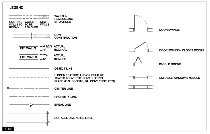
FIGURE 1-6a
Common graphic notations used in orthographic projection drawings.
The design drawings most commonly used in scaled delineation of interior environments are floor plans, interior elevations, sections, and reflected ceiling plans. These drawings, called ORTHOGRAPHIC PROJEC- TIONS, are created by projecting information about an object onto an imaginary plane known as the PICTURE PLANE. This direct projection of an object’s dimensions allows orthographic projections to retain shape and proportion, making these drawings accurate and precise.
Orthographic projection creates fragmentary views of an object, resulting in the need for multiple drawings. This means that because of their fragmentary nature orthographic projections become parts of a system and are mutually dependent on one another. By their nature, orthographic projections appear flat and lack the three-dimensional quality of perspective drawings. One way to visualize orthographic projection is to imagine an object enclosed in a transparent box. Each transparent plane of the enclosing box serves as the picture plane for that face of the object
The view through the top plane of the enclosing box is called a PLAN. In a plan view only those elements seen when looking directly down at the object are drawn. Figure 1-2 depicts a roof plan.
The views through the picture planes that form the sides of the enclosing box are called ELEVATIONS. Elevations depict only what is visible when viewed directly through the picture plane. Figure 1-3 is an exterior elevation.
FIGURE 1-6b
Graphic symbols used for references and notes. Items shown with a 1 near them are reference symbols that include a number on top of another number. The number on top refers to the drawing number and the lower number refers to the sheet the drawing may be found on.
A SECTION portrays a view of the object or building with a vertical plane sliced through it and removed. One way of understanding section views is to imagine that a very sharp plane has been inserted into the object or building, cutting neatly into it and revealing the structure and complexity of the object’s form (see Figure 1-4).
A FLOOR PLAN, also known as a horizontal section, portrays a view of the building with a horizontal plane sliced through it and removed, exposing the thickness of the walls and the elements below the cut line such as floor finishes and furniture (see Figure 1-5).
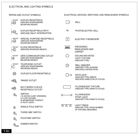
Orthographic projection drawings are clearly an abstraction of reality and use specific conventions to delineate space and materials. Unlike some other forms of drawing, orthographic projection drawings require adherence to conventions, proportional scale, and accuracy of line; these design drawings are highly standardized so that they carry universal meaning. Therefore, items such as walls, doors, windows, property boundaries, references to other drawings and other items are represented by very specific graphic symbols or combinations of lines. Figures 1-6a, 1-6b, and 1-6c illustrate some graphic notations used in these types of drawings such as wall lines, door and window symbols, as well as reference and notation symbols.
FIGURE 1-6c
Graphic symbols used for lighting and electrical information. Figures 1-6a through 1-6c drawn by Melissa Brewer
ORTHOGRAPHIC PROJECTION DRAWINGS FOR INTERIOR ENVIRONMENTS
The special orthographic projection drawings used in delineation of interior environments are based on the concepts mentioned to this point. These drawings impart information particular to interior construction.
Floor Plans
As stated, floor plans can also be called HORIZONTAL BUILDING SECTIONS, this is because they are drawn as though a horizontal cut has been made in the building (typically between 3 feet 6 inches and 5 feet 6 inches above the floor) as shown in Figure 1-7. Cutting into the building at this location exposes the thickness of walls and other structural elements, and shows windows, doors, and can show floor finishes and furnishings—all of which are located below the location of the cut.
In the United States, floor plans are most often drawn at a scale of 1/8” = 1’0” or ¼” = 1’0”, although this varies according to project conditions. Larger-scale floor plans are useful for presentation of complex or highly detailed spaces. Smaller-scale floor plans are required for large projects and are also used as key plans in complex presentations. In creating floor plans using metric measurements, a scale of 1:50 is relatively common; it is somewhat similar to ¼” = 1’0” scale (that would be 1:48 to be exact). Architectural drawings—other than small-scale interior related drawings, such as the floor plans mentioned—are commonly drawn using a metric scale of 1:100.
FIGURE 1-7
A floor plan is created when the picture plane cuts through the building horizontally, at 3’6” and 5’6” above floor level.
In drawing floor plans it is important to convey significant spatial relationships with consistent graphic conventions. Various line weights are used to convey depths and qualities of form. In standard floor plans the boldest line weight is used to outline those elements that have been cut through and are closest to the viewer (such as full-height wall lines). An intermediate line weight is employed to outline objects that lie below the plane of the cut but above the floor plane, such as fixtures, built-ins, and furnishings. A finer line weight is used to outline surface treatment of floors and other horizontal planes, such as tile and wood grain. Objects that are hidden, such as shelves, or above the plane of the cut are dashed or ghosted in; this must be done in a manner that is consistent throughout the presentation.
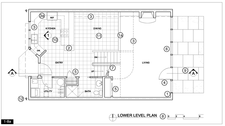
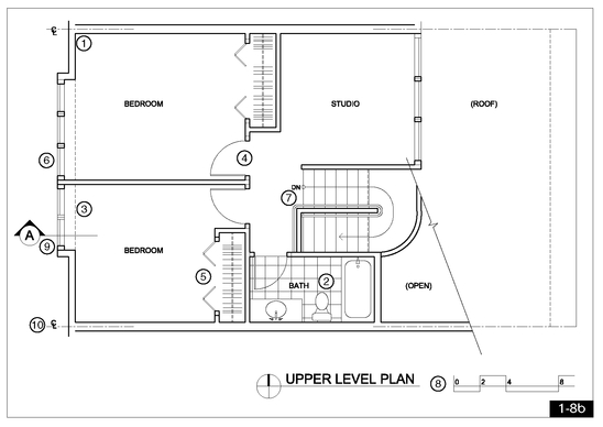
Figures 1-8a and 1-8b are examples of town-house floor plans drawn using AutoCAD software and employing standard conventions and reference symbols. Figures 1-8c is an enlarged portion of the floor plan included to show detailed information.
Standard doors are generally drawn open at 90 degrees to the wall and are often shown with the arc of their swing. The door frame and the space it requires must be considered in the drawing of the door system (this means the dimensions of the frame must be considered). Doors other than standard such as smaller swinging closet doors, bi-fold, sliding and pocket types are drawn in a manner that is consistent with their construction as shown in Figure 1-6a. Windowsills are typically outlined, often with a lighter line weight at the sill only. Window frames and sheets of glass are shown in various details as scale allows. Stairs are generally shown as broken off past the height of the plane of the cut; this is signified with a special cut or breakline as shown in Figure 1-8a. An arrow should be included to indicate the direction of the stairs from the level of the floor plan, with the word UP or DOWN (DN) adjacent to the directional arrow.
FIGURE 1-8a
Town-house lower-level floor plan employing standard drafting conventions.
1. Boldest lines indicate the location of cut, meaning full-height walls are bold. Lower walls may be shown with lighter line weights (1a).
2. Fixtures, cabinetry, and finish materials are drawn with progressively lighter lines as they recede from the cut location.
3. Elements that are above or below the cut line—such as cabinets (3a) and soffits—or hidden such as dishwashers, are indicated with dashed lines.
4. Standard doors are drawn open at 90 degrees with the arc of swing shown; the full swing can be shown ensure that nothing impedes the full swing of the door.
5. Specialized doors, such as smaller closet doors (shown), bi-fold doors, sliding doors, and pocket doors, are drawn in a way that indicates size and construction.
6. Window glass and sill lines are shown, often with a lighter-weight line than walls.
7. Stairs are drawn as broken off past the line of the cut; a special breakline is used.
8. A title, north arrow, and scale notation are required on all plans. Because this drawing was reduced, a standard written scale was omitted; instead, a graphic scale device is included.
9. This is a section reference symbol. The arrow indicates the direction of the view of the section.
10. This is an elevation reference symbol. The arrow indicates the direction of the elevation view. The number indicates the particular drawing that is referenced.
11. Flooring materials may be shown as required (using a light line weight).
12. This is a centerline, indicating the centerline of the shared wall in the town house.
A title, a north arrow, and some type of scale notation should be included on all floor plans. Scale notation can be stated numerically, for example: ¼” = 1’0”. Current practice often requires the use of a graphic scaling device, which allows for reduction, enlargement, and electronic transmission of the drawings.
FIGURE 1-8b
1. Boldest lines indicate the location of cut, meaning full-height walls are bold. Lower walls may be shown with lighter line weights (1a).
2. Fixtures, cabinetry, and finish materials are drawn with progressively lighter lines as they recede from the cut location.
3. Elements that are above or below the cut line—such as cabinets (3a) and soffits—or hidden such as dishwashers, are indicated with dashed lines.
4. Standard doors are drawn open at 90 degrees with the arc of swing shown; the full swing can be shown ensure that nothing impedes the full swing of the door.
5. Specialized doors, such as smaller closet doors (shown), bi-fold doors, sliding doors, and pocket doors, are drawn in a way that indicates size and construction.
6. Window glass and sill lines are shown, often with a lighter-weight line than walls.
7. Stairs are drawn as broken off past the line of the cut; stairs from lower floors are shown.
8. A title, north arrow, and scale notation are required on all plans. Because this drawing was reduced, a standard written scale was omitted; instead, a graphic scale device is included.
9. This is a section reference symbol. The arrow indicates the direction of the view of the section.
10. These are elevation reference symbols. The arrow indicates the direction of the view of the elevation.
11. This is a centerline, indicating the centerline of the shared wall in the town house.
Symbols relating the floor plan to additional orthographic views or details are often drawn on the floor plan and serve as cross-references.
Successful floor plan presentation drawings require a thorough understanding of drafting conventions. Presentation floor plans may be drawn fastidiously with tools or drawn freehand. Regardless of the style of drawing, presentation floor plans must be accurate and drawn to the appropriate scale so that they communicate the design and can be used by the designer as the project moves forward. Presentation floor plans are enhanced by the use of tone, value, color, and other graphic devices. The graphic enhancement of floor plans is discussed in greater detail in Chapter 5, page 151. Additional examples of plans for commercial projects may be found at the end of this chapter beginning with Figures 1-17a and 1-18a.
Interior Elevations
Just as exterior elevations are created to reveal exterior elements and features, interior elevations reveal the interior features of a building. One way to understand the creation of interior elevations is to imagine ourselves inside the room we are drawing. Imagine standing inside a room facing one wall directly, with a large sheet of glass (the picture plane) inserted between the viewer and the wall. The interior elevation can then be created by outlining (projecting onto the picture plane) the significant features of the wall. Each wall of the room can be drawn in elevation by means of projecting what is visible as the viewer faces that wall directly as illustrated in Figure 1-9.
Interior elevations are used extensively in professional practice. Successful elevations must clearly depict all interior architectural elements in a consistent scale. Interior elevations are typically drawn in a scale ranging from ¼” = 1’0” to 1” = 1’0”. Elevations drawn to depict accessories, equipment, cabinetry, fixtures, and design details are often drawn at 3/8” = 1’0” or ½” = 1’0”. Millwork and other highly complicated elevations are often drawn at ½” = 1’0” or larger.
FIGURE 1-8c 1. Boldest line
2. Secondary line weights
3. Lighter line weight.
Figures 1-8a to 1-8c design by Courtney Nystuen; drawn by Melissa Brewer
All elevations require the use of differing line weights to clearly communicate spatial relationships. Typically, any portion of walls cut through and those closest to the viewer are drawn using a bold line weight. Receding elements become progressively lighter in line weight as they move farther from the picture plane. Some designers draw the line representing the ground line as the boldest, with those lines representing the top and sides of the wall drawn just slightly lighter in weight. Figure 1-10 depicts kitchen elevations for the town-house project.
Drawing interior elevations by hand or digitally can be difficult for beginning students to master and requires a clear understanding of the concepts involved. To this end, a plan and elevations for another project can be found in Appendix 3; additional drawing examples may also be found at the end of this chapter (see Figures 1-17a, 1-17d, 1-18a, and 1-18c).
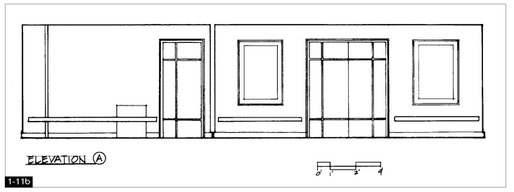
Interior elevations are an excellent vehicle for developing and refining interior details as illustrated by Figures 1-11a and 1-11b, which are interior elevations depicting very different design schemes for the same lobby space.
Like floor plans, elevations used for design presentations vary greatly from those used for construction. Elevations used for construction drawings must necessarily contain significant dimensions as well as appropriate technical information as illustrated at the end of this chapter (see Figures 1-17d and 1-18c). Those used for presentations can be drawn more freely and often contain less technical information but must be drawn accurately and in consistent scale. Figure 1-12 is a preliminary elevation sketch created to convey design elements for a professionally designed project.
FIGURE 1-9
In drawing interior elevations, the picture plane is inserted between the viewer and wall(s). What is visible through the picture plane is drawn in elevation.
FIGURE 1-10
1. Portions of walls cut into or closest to viewer are bold.
2. Receding elements are drawn with progressively lighter lines.
3. In elevations including cabinetry and or millwork, details such as countertops, door frames, and hardware should be included.
4. Interior elevations require titles, reference symbols (names or numbers), and scale notation.
FIGURE 1-11a
This elevation delineates a traditional wood-paneling design treatment for a hotel lobby. Because this drawing was reduced, a graphic scale notation was used in place of written information.
FIGURE 1-11b
This elevation delineates a completely different design approach for the hotel lobby shown in Figure 1-11a. Because this drawing was reduced, a graphic scale notation was used in place of written information.
For elevations to work well in visual presentations, they must be clearly keyed, noted, or referenced to the floor plan. Regardless of the referencing method used, titles must be included beneath all elevations and scale should always be noted. Elevations used for presentations are enhanced by the use of tone, value, color, and other graphic devices, many of which are discussed in Chapter 5.
Sections
As described earlier, a building section is a view created as though a vertical plane has cut through the building and been removed. Unlike interior elevations, which depict only what occurs inside the interior; sections can expose the structure of the building. In drawing sections, it is important to include the outline of the structural elements as well as the internal configuration of the interior space. Sections require varied line weights as a means of describing depths and spatial relationships. It is typical to show what is cut through, and therefore closest to the viewer, in the boldest line weight; receding features and details are drawn using progressively lighter line weights.
FIGURE 1-12
A preliminary elevation study for a professional project, drawn on tracing paper with markers.
By Cuningham Group Architecture, P.A.


