
Table of Contents
Part I: Using Excel to Summarize Marketing Data
Chapter 1: Slicing and Dicing Marketing Data with PivotTables
Analyzing Sales at True Colors Hardware
Analyzing Sales at La Petit Bakery
Analyzing How Demographics Affect Sales
Pulling Data from a PivotTable with the GETPIVOTDATA Function
Summary
Exercises
Chapter 2: Using Excel Charts to Summarize Marketing Data
Combination Charts
Using a PivotChart to Summarize Market Research Surveys
Ensuring Charts Update Automatically When New Data is Added
Making Chart Labels Dynamic
Summarizing Monthly Sales-Force Rankings
Using Check Boxes to Control Data in a Chart
Using Sparklines to Summarize Multiple Data Series
Using GETPIVOTDATA to Create the End-of-Week Sales Report
Summary
Exercises
Chapter 3: Using Excel Functions to Summarize Marketing Data
Summarizing Data with a Histogram
Using Statistical Functions to Summarize Marketing Data
Summary
Exercises
Part II: Pricing
Chapter 4: Estimating Demand Curves and Using Solver to Optimize Price
Estimating Linear and Power Demand Curves
Using the Excel Solver to Optimize Price
Pricing Using Subjectively Estimated Demand Curves
Using SolverTable to Price Multiple Products
Summary
Exercises
Chapter 5: Price Bundling
Why Bundle?
Using Evolutionary Solver to Find Optimal Bundle Prices
Summary
Exercises
Chapter 6: Nonlinear Pricing
Demand Curves and Willingness to Pay
Profit Maximizing with Nonlinear Pricing Strategies
Summary
Exercises
Chapter 7: Price Skimming and Sales
Dropping Prices Over Time
Why Have Sales?
Summary
Exercises
Chapter 8: Revenue Management
Estimating Demand for the Bates Motel and Segmenting Customers
Handling Uncertainty
Markdown Pricing
Summary
Exercises
Part III: Forecasting
Chapter 9: Simple Linear Regression and Correlation
Simple Linear Regression
Using Correlations to Summarize Linear Relationships
Summary
Exercises
Chapter 10: Using Multiple Regression to Forecast Sales
Introducing Multiple Linear Regression
Running a Regression with the Data Analysis Add-In
Interpreting the Regression Output
Using Qualitative Independent Variables in Regression
Modeling Interactions and Nonlinearities
Testing Validity of Regression Assumptions
Multicollinearity
Validation of a Regression
Summary
Exercises
Chapter 11: Forecasting in the Presence of Special Events
Building the Basic Model
Summary
Exercises
Chapter 12: Modeling Trend and Seasonality
Using Moving Averages to Smooth Data and Eliminate Seasonality
An Additive Model with Trends and Seasonality
A Multiplicative Model with Trend and Seasonality
Summary
Exercises
Chapter 13: Ratio to Moving Average Forecasting Method
Using the Ratio to Moving Average Method
Applying the Ratio to Moving Average Method to Monthly Data
Summary
Exercises
Chapter 14: Winter's Method
Parameter Definitions for Winter's Method
Initializing Winter's Method
Estimating the Smoothing Constants
Forecasting Future Months
Mean Absolute Percentage Error (MAPE)
Summary
Exercises
Chapter 15: Using Neural Networks to Forecast Sales
Regression and Neural Nets
Using Neural Networks
Using NeuralTools to Predict Sales
Using NeuralTools to Forecast Airline Miles
Summary
Exercises
Part IV: What do Customers Want?
Chapter 16: Conjoint Analysis
Products, Attributes, and Levels
Full Profile Conjoint Analysis
Using Evolutionary Solver to Generate Product Profiles
Developing a Conjoint Simulator
Examining Other Forms of Conjoint Analysis
Summary
Exercises
Chapter 17: Logistic Regression
Why Logistic Regression Is Necessary
Logistic Regression Model
Maximum Likelihood Estimate of Logistic Regression Model
Using StatTools to Estimate and Test Logistic Regression Hypotheses
Performing a Logistic Regression with Count Data
Summary
Exercises
Chapter 18: Discrete Choice Analysis
Random Utility Theory
Discrete Choice Analysis of Chocolate Preferences
Incorporating Price and Brand Equity into Discrete Choice Analysis
Dynamic Discrete Choice
Independence of Irrelevant Alternatives (IIA) Assumption
Discrete Choice and Price Elasticity
Summary
Part V: Customer Value
Chapter 19: Calculating Lifetime Customer Value
Basic Customer Value Template
Measuring Sensitivity Analysis with Two-way Tables
An Explicit Formula for the Multiplier
Varying Margins
DIRECTV, Customer Value, and Friday Night Lights (FNL)
Estimating the Chance a Customer Is Still Active
Going Beyond the Basic Customer Lifetime Value Model
Summary
Chapter 20: Using Customer Value to Value a Business
A Primer on Valuation
Using Customer Value to Value a Business
Measuring Sensitivity Analysis with a One-way Table
Using Customer Value to Estimate a Firm's Market Value
Summary
Chapter 21: Customer Value, Monte Carlo Simulation, and Marketing Decision Making
A Markov Chain Model of Customer Value
Using Monte Carlo Simulation to Predict Success of a Marketing Initiative
Summary
Chapter 22: Allocating Marketing Resources between Customer Acquisition and Retention
Modeling the Relationship between Spending and Customer Acquisition and Retention
Basic Model for Optimizing Retention and Acquisition Spending
An Improvement in the Basic Model
Summary
Part VI: Market Segmentation
Chapter 23: Cluster Analysis
Clustering U.S. Cities
Using Conjoint Analysis to Segment a Market
Summary
Chapter 24: Collaborative Filtering
User-Based Collaborative Filtering
Item-Based Filtering
Comparing Item- and User-Based Collaborative Filtering
The Netflix Competition
Summary
Chapter 25: Using Classification Trees for Segmentation
Introducing Decision Trees
Constructing a Decision Tree
Pruning Trees and CART
Summary
Part VII: Forecasting New Product Sales
Chapter 26: Using S Curves to Forecast Sales of a New Product
Examining S Curves
Fitting the Pearl or Logistic Curve
Fitting an S Curve with Seasonality
Fitting the Gompertz Curve
Pearl Curve versus Gompertz Curve
Summary
Chapter 27: The Bass Diffusion Model
Introducing the Bass Model
Estimating the Bass Model
Using the Bass Model to Forecast New Product Sales
Deflating Intentions Data
Using the Bass Model to Simulate Sales of a New Product
Modifications of the Bass Model
Summary
Chapter 28: Using the Copernican Principle to Predict Duration of Future Sales
Using the Copernican Principle
Simulating Remaining Life of Product
Summary
Part VIII: Retailing
Chapter 29: Market Basket Analysis and Lift
Computing Lift for Two Products
Computing Three-Way Lifts
A Data Mining Legend Debunked!
Using Lift to Optimize Store Layout
Summary
Chapter 30: RFM Analysis and Optimizing Direct Mail Campaigns
RFM Analysis
An RFM Success Story
Using the Evolutionary Solver to Optimize a Direct Mail Campaign
Summary
Chapter 31: Using the SCAN*PRO Model and Its Variants
Introducing the SCAN*PRO Model
Modeling Sales of Snickers Bars
Forecasting Software Sales
Summary
Chapter 32: Allocating Retail Space and Sales Resources
Identifying the Sales to Marketing Effort Relationship
Modeling the Marketing Response to Sales Force Effort
Optimizing Allocation of Sales Effort
Using the Gompertz Curve to Allocate Supermarket Shelf Space
Summary
Chapter 33: Forecasting Sales from Few Data Points
Predicting Movie Revenues
Modifying the Model to Improve Forecast Accuracy
Using 3 Weeks of Revenue to Forecast Movie Revenues
Summary
Part IX: Advertising
Chapter 34: Measuring the Effectiveness of Advertising
The Adstock Model
Another Model for Estimating Ad Effectiveness
Optimizing Advertising: Pulsing versus Continuous Spending
Summary
Chapter 35: Media Selection Models
A Linear Media Allocation Model
Quantity Discounts
A Monte Carlo Media Allocation Simulation
Summary
Chapter 36: Pay per Click (PPC) Online Advertising
Defining Pay per Click Advertising
Profitability Model for PPC Advertising
Google AdWords Auction
Using Bid Simulator to Optimize Your Bid
Summary
Part X: Marketing Research Tools
Chapter 37: Principal Components Analysis (PCA)
Defining PCA
Linear Combinations, Variances, and Covariances
Diving into Principal Components Analysis
Other Applications of PCA
Summary
Chapter 38: Multidimensional Scaling (MDS)
Similarity Data
MDS Analysis of U.S. City Distances
MDS Analysis of Breakfast Foods
Finding a Consumer's Ideal Point
Summary
Chapter 39: Classification Algorithms: Naive Bayes Classifier and Discriminant Analysis
Conditional Probability
Bayes' Theorem
Naive Bayes Classifier
Linear Discriminant Analysis
Model Validation
The Surprising Virtues of Naive Bayes
Summary
Chapter 40: Analysis of Variance: One-way ANOVA
Testing Whether Group Means Are Different
Example of One-way ANOVA
The Role of Variance in ANOVA
Forecasting with One-way ANOVA
Contrasts
Summary
Chapter 41: Analysis of Variance: Two-way ANOVA
Introducing Two-way ANOVA
Two-way ANOVA without Replication
Two-way ANOVA with Replication
Summary
Part XI: Internet and Social Marketing
Chapter 42: Networks
Measuring the Importance of a Node
Measuring the Importance of a Link
Summarizing Network Structure
Random and Regular Networks
The Rich Get Richer
Klout Score
Summary
Chapter 43: The Mathematics Behind The Tipping Point
Network Contagion
A Bass Version of the Tipping Point
Summary
Chapter 44: Viral Marketing
Watts' Model
A More Complex Viral Marketing Model
Summary
Chapter 45: Text Mining
Text Mining Definitions
Giving Structure to Unstructured Text
Applying Text Mining in Real Life Scenarios
Summary
Introduction
How This Book Is Organized
Who Should Read This Book
Tools You Need
What's on the Website
Errata
Summary
Chapter 1: Slicing and Dicing Marketing Data with PivotTables
Chapter 2: Using Excel Charts to Summarize Marketing Data
Chapter 3: Using Excel Functions to Summarize Marketing Data
In many marketing situations you need to analyze, or “slice and dice,” your data to gain important marketing insights. Excel PivotTables enable you to quickly summarize and describe your data in many different ways. In this chapter you learn how to use PivotTables to perform the following:
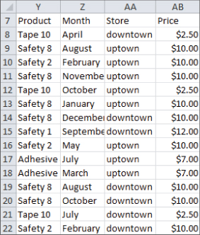
To start analyzing sales you first need some data to work with. The data worksheet from the PARETO.xlsx file (available for download on the companion website) contains sales data from two local hardware stores (uptown store owned by Billy Joel and downtown store owned by Petula Clark). Each store sells 10 types of tape, 10 types of adhesive, and 10 types of safety equipment. Figure 1.1 shows a sample of this data.
Figure 1-1: Hardware store data
Throughout this section you will learn to analyze this data using Excel PivotTables to answer the following questions:
The first step in creating a PivotTable is ensuring you have headings in the first row of your data. Notice that Row 7 of the example data in the data worksheet has the headings Product, Month, Store, and Price. Because these are in place, you can begin creating your PivotTable. To do so, perform the following steps:
Figure 1-2: PivotTable Dialog Box

Figure 1-3: PivotTable Field List

Figure 1.4 shows the completed PivotTable Field List and the resulting PivotTable is shown in Figure 1.5 as well as on the FirstorePT worksheet.
Figure 1-4: Completed PivotTable Field List

Figure 1-5: Completed PivotTable

Figure 1.5 shows the downtown store sold $4,985.50 worth of goods, and the uptown store sold $4,606.50 of goods. The total sales are $9592.
If you want a percentage breakdown of the sales by store, you need to change the way Excel displays data in the Values zone. To do this, perform these steps:
Figure 1-6: Obtaining percentage breakdown by Store

Figure 1.7 shows the resulting PivotTable with the new percentage breakdown by Store with 52 percent of the sales in the downtown store and 48 percent in the uptown store. You can also see this in the revenue by store worksheet of the PARETO.xlsx file.
Figure 1-7: Percentage breakdown by Store

You can also use a PivotTable to break down the total revenue by month and calculate the percentage of sales that occur during each month. To accomplish this, perform the following steps:
Figure 1-8: Monthly percentage breakdown of Revenue

You can see that $845 worth of goods was sold in January and 8.81 percent of the sales were in January. Because the percentage of sales in each month is approximately 1/12 (8.33 percent), the stores exhibit little seasonality. Part III, “Forecasting Sales of Existing Products,” includes an extensive discussion of how to estimate seasonality and the importance of seasonality in marketing analytics.
Another important part of analyzing data includes determining the revenue generated by each product. To determine this for the example data, perform the following steps:
Figure 1-9: Sales by Product

You can now see the revenue that each product generated individually. For example, Adhesive 1 generated $24 worth of revenue.
When slicing and dicing data you may encounter a situation in which you want to find which set of products generates a certain percentage of total sales. The well-known Pareto 80–20 Principle states that for most companies 20 percent of their products generate around 80 percent of their sales. Other examples of the Pareto Principle include the following:
To determine a percentage breakdown of sales by product, perform the following steps:
Figure 1-10: Using Value Filters to select products generating 80% of sales

The resulting PivotTable appears in the Top 80% worksheet (see Figure 1.11) and shows that the six products displayed in Figure 1.11 are the smallest set of products generating at least 80 percent of the revenue. Therefore only 20 percent of the products (6 out of 30) are needed to generate 80 percent of the sales.
Figure 1-11: 6 Products Generate 80% of Revenue

One helpful tool for analyzing data is the Report Filter and the exciting Excel 2010 and 2013 Slicers Feature. Suppose you want to break down sales from the example data by month and store, but you feel showing the list of products in the Row or Column Labels zones would clutter the PivotTable. Instead, you can drag the Month field to the Row Labels zone, the Store field to the Column Labels zone, the Price field to the Value zone, and the Product field to the Report Filter zone. This yields the PivotTable in worksheet Report filter unfiltered, as shown in Figure 1.12.
Figure 1-12: PivotTable used to illustrate Slicers

By clicking the drop-down arrow in the Report Filter, you can display the total revenue by Store and Month for any subset of products. For example, if you select products Safety 1, Safety 7, and Adhesive 8, you can obtain the PivotTable in the Filtered with a slicer worksheet, as shown in Figure 1.13. You see here that during May, sales of these products downtown are $10.00 and uptown are $34.00.
Figure 1-13: PivotTable showing sales for Safety 1, Safety 7 and Adhesive 8

As you can see from Figure 1.13, it is difficult to know which products were used in the PivotTable calculations. The new Slicer feature in Excel 2010 and 2013 (see the Filtered with a slicer worksheet) remedies this problem. To use this tool perform the following steps:
Figure 1-14: Slicer selection for sales of Safety 1, Safety 7 and Adhesive 8.

A Slicer provides sort of a “dashboard” to filter on subsets of items drawn from a PivotTable field(s). The Slicer in the Filtered with a slicer worksheet makes it obvious that the calculations refer to Safety 1, Safety 7, and Adhesive 8. If you hold down the Control key, you can easily resize a Slicer.
Figure 1-15: Drilling down on January Downtown Sales

You have learned how PivotTables can be used to slice and dice sales data. Judicious use of the Value Fields Settings capability is often the key to performing the needed calculations.
La Petit Bakery sells cakes, pies, cookies, coffee, and smoothies. The owner has hired you to analyze factors affecting sales of these products. With a PivotTable and all the analysis skills you now have, you can quickly describe the important factors affecting sales. This example paves the way for a more detailed analysis in Part III of this book.
The file BakeryData.xlsx contains the data for this example and the file LaPetitBakery.xlsx contains all the completed PivotTables. In the Bakerydata.xlsx workbook you can see the underlying daily sales data recorded for the years 2013–2015. Figure 1.16 shows a subset of this data.
Figure 1-16: Data for La Petit Bakery

A 1 in the weekday column indicates the day was Monday, a 2 indicates Tuesday, and so on. You can obtain these days of the week by entering the formula = WEEKDAY(G5,2) in cell F5 and copying this formula from F5 to the range F6:F1099. The second argument of 2 in the formula ensures that a Monday is recorded as 1, a Tuesday as 2, and so on. In cell E5 you can enter the formula =VLOOKUP(F5,lookday,2) to transform the 1 in the weekday column to the actual word Monday, the 2 to Tuesday, and so on. The second argument lookday in the formula refers to the cell range A6:B12.
The VLOOKUP function finds the value in cell F5 (2) in the first column of the lookday range and replaces it with the value in the same row and second column of the lookday range (Tuesday.) Copying the formula =VLOOKUP(F5,lookday,2) from E5 to E6:E1099 gives you the day of the week for each observation. For example, on Friday, January 11, 2013, there was no promotion and 74 cakes, 50 pies, 645 cookies, 100 smoothies, and 490 cups of coffee were sold.
Now you will learn how to use PivotTables to summarize how La Petit Bakery's sales are affected by the following:
La Petit Bakery wants to know how sales of their products vary with the day of the week. This will help them better plan production of their products.
In the day of week worksheet you can create a PivotTable that summarizes the average daily number of each product sold on each day of the week (see Figure 1.17). To create this PivotTable, perform the following steps:
Figure 1-17: Daily breakdown of Product Sales

As the saying (originally attributed to Confucius) goes, “A picture is worth a thousand words.” If you click in a PivotTable and go up to the Options tab and select PivotChart, you can choose any of Excel's chart options to summarize the data (Chapter 2, “Using Excel Charts to Summarize Marketing Data,” discusses Excel charting further). Figure 1.17 (see the Daily Breakdown worksheet) shows the first Line option chart type. To change this, right-click any series in a chart. The example chart here shows that all products sell more on the weekend than during the week. In the lower left corner of the chart, you can filter to show data for any subset of weekdays you want.
If product sales are approximately the same during each month, they do not exhibit seasonality. If, however, product sales are noticeably higher (or lower) than average during certain quarters, the product exhibits seasonality. From a marketing standpoint, you must determine the presence and magnitude of seasonality to more efficiently plan advertising, promotions, and manufacturing decisions and investments. Some real-life illustrations of seasonality include the following:
To determine if La Petit Bakery products exhibit seasonality, you can perform the following steps:
Figure 1-18: Grouping data by Month

Figure 1-19: Monthly breakdown of Bakery Sales

This chart makes it clear that smoothie sales spike upward in the summer, but sales of other products exhibit little seasonality. In Part III of this book you can find an extensive discussion of how to estimate seasonality.
Given the strong seasonality and corresponding uptick in smoothie sales, the bakery can probably “trim” advertising and promotions expenditures for smoothies between April and August. On the other hand, to match the increased demand for smoothies, the bakery may want to guarantee the availability and delivery of the ingredients needed for making its smoothies. Similarly, if the increased demand places stress on the bakery's capability to serve its customers, it may consider hiring extra workers during the summer months.
The owners of La Petit Bakery want to know if sales are improving. Looking at a graph of each product's sales by month will not answer this question if seasonality is present. For example, Amazon.com has lower sales every January than the previous month due to Christmas. A better way to analyze this type of trend is to compute and chart average daily sales for each year. To perform this analysis, complete the following steps:
Figure 1-20: Summary of Sales by Year

The annual growth rates for products vary between 1.5 percent and 4.9 percent. Cake sales have grown at the fastest rate, but represent a small part of overall sales. Cookies and coffee sales have grown more slowly, but represent a much larger percentage of revenues.
To get a quick idea of how promotions affect sales, you can determine average sales for each product on the days you have promotions and compare the average on days with promotions to the days without promotions. To perform these computations keep the same fields in the Value zone as before, and drag the Promotion field to the Row Labels zone. After creating a line PivotChart, you can obtain the results, as shown in Figure 1.21 (see the promotion worksheet).
Figure 1-21: Effect of Promotion on Sales

The chart makes it clear that sales are higher when you have a promotion. Before concluding, however, that promotions increase sales, you must “adjust” for other factors that might affect sales. For example, if all smoothie promotions occurred during summer days, seasonality would make the average sales of smoothies on promotions higher than days without promotions, even if promotions had no real effect on sales. Additional considerations for using promotions include costs; if the costs of the promotions outweigh the benefits, then the promotion should not be undertaken. The marketing analyst must be careful in computing the benefits of a promotion. If the promotion yields new customers, then the long-run value of the new customers (see Part V) should be included in the benefit of the promotion. In Parts VIII and IX of this book you can learn how to perform more rigorous analysis to determine how marketing decisions such as promotions, price changes, and advertising influence product sales.
Before the marketing analyst recommends where to advertise a product (see Part IX), she needs to understand the type of person who is likely to purchase the product. For example, a heavy metal fan magazine is unlikely to appeal to retirees, so advertising this product on a television show that appeals to retirees (such as Golden Girls) would be an inefficient use of the advertising budget. In this section you will learn how to use PivotTables to describe the demographic of people who purchase a product.
Take a look at the data worksheet in the espn.xlsx file. This has demographic information on a randomly chosen sample of 1,024 subscribers to ESPN: The Magazine. Figure 1.22 shows a sample of this data. For example, the first listed subscriber is a 72-year-old male living in a rural location with an annual family income of $72,000.
Figure 1-22: Demographic data for ESPN: The Magazine

One of the most useful pieces of demographic information is age. To describe the age of subscribers, you can perform the following steps:
Figure 1-23: Age distribution of subscribers

You find that most of the magazine's subscribers are in the 18–37 age group. This knowledge can help ESPN find TV shows to advertise that target the right age demographic.
You can also analyze the gender demographics of ESPN: The Magazine subscribers. This will help the analyst to efficiently spend available ad dollars. After all, if all subscribers are male, you probably do not want to place an ad on Project Runway.
Figure 1-24: Gender breakdown of subscribers

You find that approximately 80 percent of subscribers are men, so ESPN may not want to advertise on The View!
In the Income worksheet (see Figure 1.25) you see a breakdown of the percentage of subscribers in each income group. This can be determined by performing the following steps:
Figure 1-25: Income distribution of subscribers

You see that a majority of subscribers are in the $54,000–$103,000 range. In addition, more than 85 percent of ESPN: The Magazine subscribers have income levels well above the national median household income, making them an attractive audience for ESPN's additional marketing efforts.
Next you will determine the breakdown of ESPN: The Magazine subscribers between suburbs, urban, and rural areas. This will help the analyst recommend the TV stations where ads should be placed.
Figure 1-26: Breakdown of Subscriber Location

Often marketers break down customer demographics simultaneously on two attributes. Such an analysis is called a crosstabs analysis. In the data worksheet you can perform a crosstabs analysis on Age and Income. To do so, perform the following steps:
Figure 1-27: Crosstabs Analysis of subscribers

Crosstabs analyses enable companies to identify specific combinations of customer demographics that can be used for a more precise allocation of their marketing investments, such as advertising and promotions expenditures. Crosstabs analyses are also useful to determine where firms should not make investments. For instance, there are hardly any subscribers to ESPN: The Magazine that are 78 or older, or with household incomes above $229,000, so placing ads on TV shows that are heavily watched by wealthy retiree is not recommended.
Often a marketing analyst wants to pull data from a PivotTable to use as source information for a chart or other analyses. You can achieve this by using the GETPIVOTDATA function. To illustrate the use of the GETPIVOTDATA function, take a second look at the True Colors hardware store data in the products worksheet from the PARETO.xlsx file.
This formula always picks out Adhesive 8 sales from the Price field in the PivotTable whose upper left corner is cell A3. Even if the set of products sold changes, this function still pulls Adhesive 8 sales.
In Excel 2010 or 2013 if you want to be able to click in a PivotTable and return a cell reference rather than a GETPIVOTTABLE function, simply choose File → Options, and from the Formulas dialog box uncheck the Use GetPivotData functions for the PivotTable References option (see Figure 1.28).
Figure 1-28: Example of GETPIVOTDATA function

This function is widely used in the corporate world and people who do not know it are at a severe disadvantage in making best use of PivotTables. Chapter 2 covers this topic in greater detail.
In this chapter you learned the following:
An important component of using analytics in business is a push towards “visualization.” Marketing analysts often have to sift through mounds of data to draw important conclusions. Many times these conclusions are best represented in a chart or graph. As Confucius said, “a picture is worth a thousand words.” This chapter focuses on developing Excel charting skills to enhance your ability to effectively summarize and present marketing data. This chapter covers the following skills:
Companies often graph actual monthly sales and targeted monthly sales. If the marketing analyst plots both these series with straight lines it is difficult to differentiate between actual and target sales. For this reason analysts often summarize actual sales versus targeted sales via a combination chart in which the two series are displayed using different formats (such as a line and column graph.) This section explains how to create a similar combination chart.
All work for this chapter is located in the file Chapter2charts.xlsx. In the worksheet Combinations you see actual and target sales for the months January through July. To begin charting each month's actual and target sales, select the range F5:H12 and choose a line chart from the Insert tab. This yields a chart with both actual and target sales displayed as lines. This is the second chart shown in Figure 2.1; however, it is difficult to see the difference between the two lines here. You can avoid this by changing the format of one of the lines to a column graph. To do so, perform the following steps:
Figure 2-1: Combination chart

With the first chart, it is now easy to distinguish between the Actual and Target sales for each month. A chart like this with multiple types of graphs is called a combination chart.
You'll likely come across a situation in which you want to graph two series, but two series differ greatly in magnitude, so using the same vertical axis for each series results in one series being barely visible. In this case you need to include a secondary axis for one of the series. When you choose a secondary axis for a series Excel tries to scale the values of the axis to be consistent with the data values for that series. To illustrate the creation of a secondary axis, use the data in the Secondary Axis worksheet. This worksheet gives you monthly revenue and units sold for a company that sells expensive diamonds.
Because diamonds are expensive, naturally the monthly revenue is much larger than the units sold. This makes it difficult to see both revenue and units sold with only a single vertical axis. You can use a secondary axis here to more clearly summarize the monthly units sold and revenue earned. To do so, perform the following steps:
Figure 2-2: Line graph shows need for Secondary Axis

The resulting chart is shown in Figure 2.3, and you can now easily see how closely units and revenue move together. This occurs because Revenue=Average price*units sold, and if the average price during each month is constant, the revenue and units sold series will move in tandem. Your chart indeed indicates that average price is consistent for the charted data.
Figure 2-3: Chart with a secondary axis

While column graphs are quite useful for analyzing data, they tend to grow dull day after day. Every once in a while, perhaps in a big presentation to a potential client, you might want to spice up a column graph here and there. For instance, in a column graph of your company's sales you could add a picture of your company's product to represent sales. Therefore if you sell Ferraris, you could use a .bmp image of a Ferrari in place of a bar to represent sales. To do this, perform the following steps:
Figure 2-4: Dialog box for creating picture graph

The resulting chart is shown in Figure 2.5, as well as in the Picture worksheet.
Figure 2-5: Ferrari picture graph

Often you want to add data labels or a table to a graph to indicate the numerical values being graphed. You can learn to do this by using example data that shows monthly sales of product lines at the True Color Department Store. Refer to the Labels and Tables worksheet for this section's examples.
To begin adding labels to a graph, perform the following steps: